Create a distinctive hat brand with real presence, without making it feel like a costume.

01 / Case study
RED
SPUR
A hat identity with grit, craft and a clear point of view.
02 / The brand
Made for
the long ride.
Pride, independence and the quiet sense that you belong to a particular world.
Leather brown, dust red, saddle tan and black: raw materials, used with restraint.
03 / Creative direction
Built like
a stitched patch.
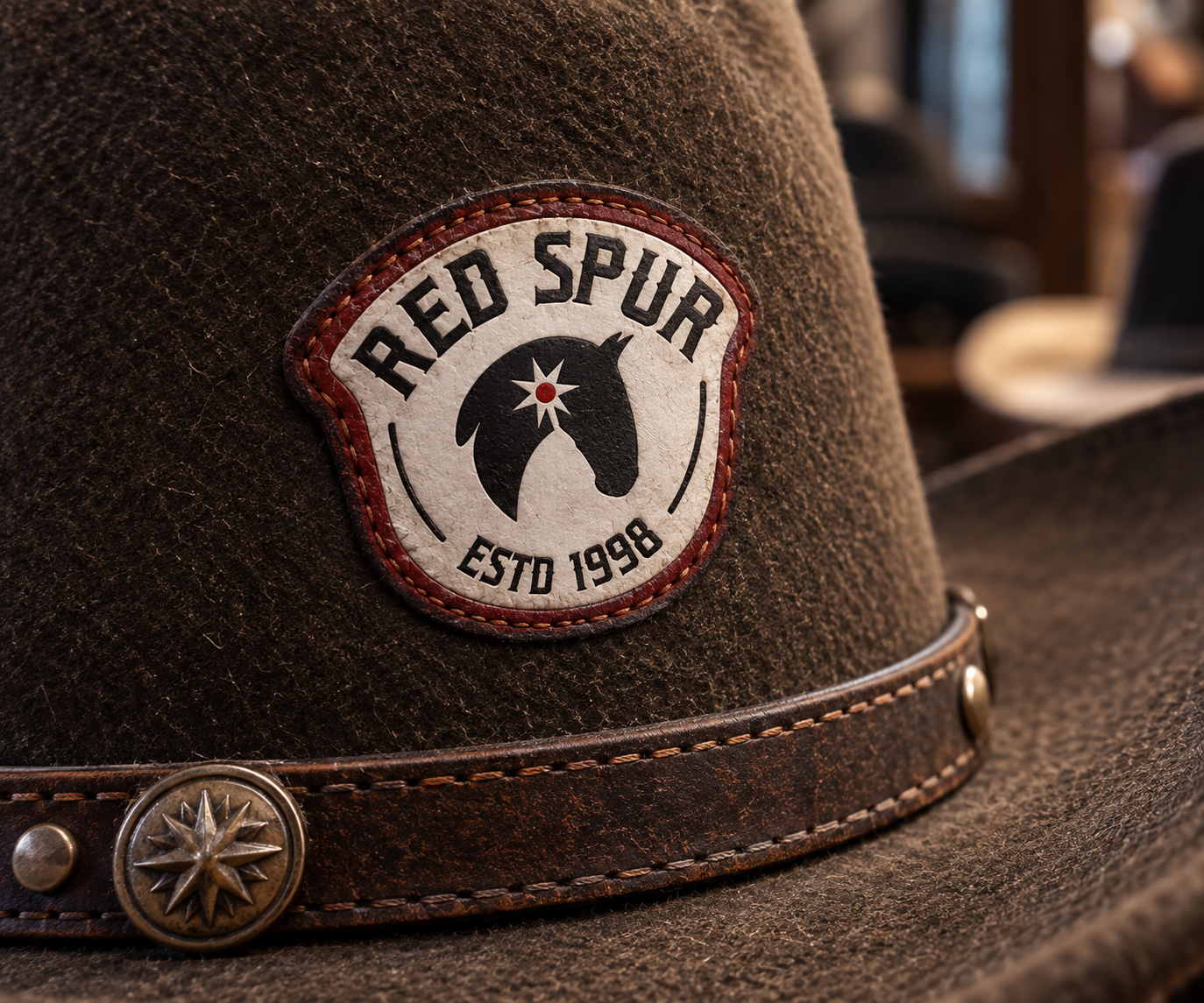
The creative direction started with an object, not a polished logo on a screen: a patch you would stitch onto a hat, jacket or saddle bag. The mark needed weight, texture and a little roughness—strong enough to work in embroidery, leather, metal and ink.
Leather brown, dust red, saddle tan and black give the system its lived-in character. Every choice helps RED SPUR feel made for the things people keep and wear, rather than a Western theme added on top.
Project scope Brand strategy · Visual identity · Logo design · Art direction · Brand applications
04 / The symbol
A horse head.
A hidden spur.
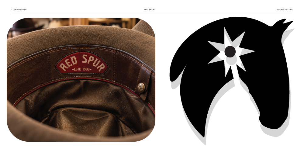
The mark begins with the profile of a horse’s head, inspired by a Pura Raza Española stallion. Within it, the negative space reveals a spur; that same shape also creates the bend of the horse’s neck. The two references are built into one compact form, rather than placed side by side.

05 / In real life
At home
in the West.
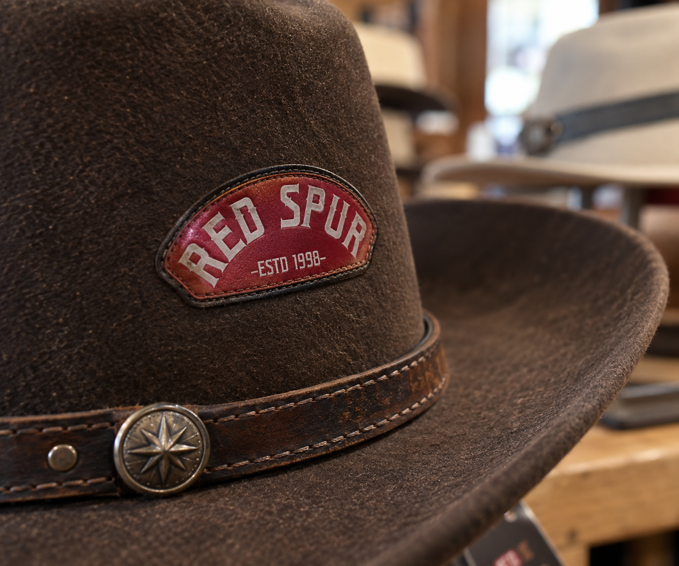
RED SPUR is for people who are already part of this world. The identity simply makes that affiliation recognisable.
← Back to case studies