Give a sociable tapas bar a distinctive presence without falling back on predictable Spanish-restaurant styling.

01 / Case study
BOCADO
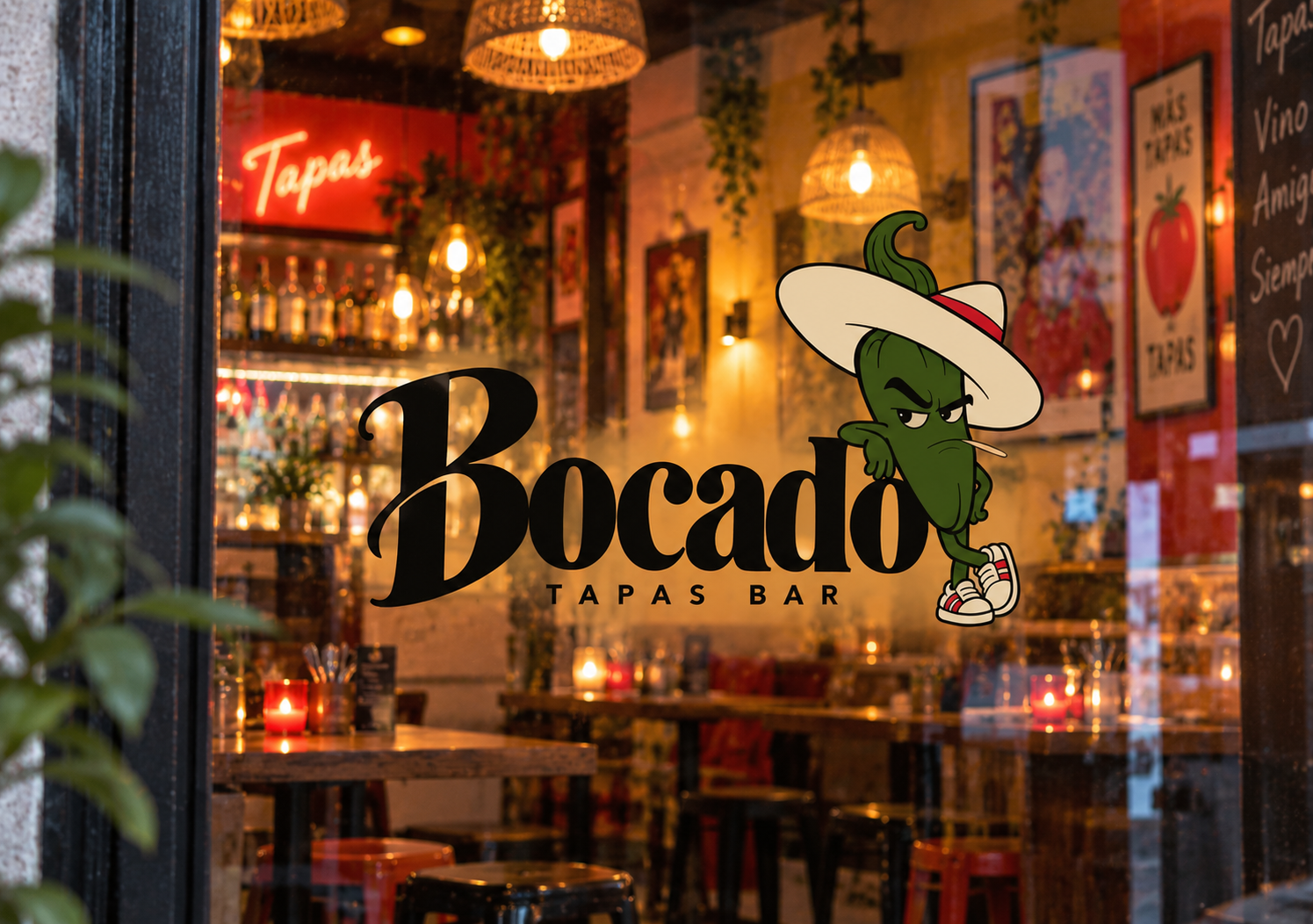
A tapas-bar identity built around a pepper with a point of view.
02 / The brand
Hospitality with
a little attitude.
Tapas brands can easily slip into the same visual shorthand: rustic tiles, predictable colour, a lot of noise. BOCADO needed a world that still felt sociable and warm, but more ownable—contemporary, playful and confident enough not to work too hard for attention.
Easy familiarity, a little humour and the feeling that this is a place you already want to return to.
We remember faces and expressions faster than explanations. A recurring character makes the brand feel familiar while giving people a small detail to notice again.
04 / Creative direction
Give the bar
a familiar face.
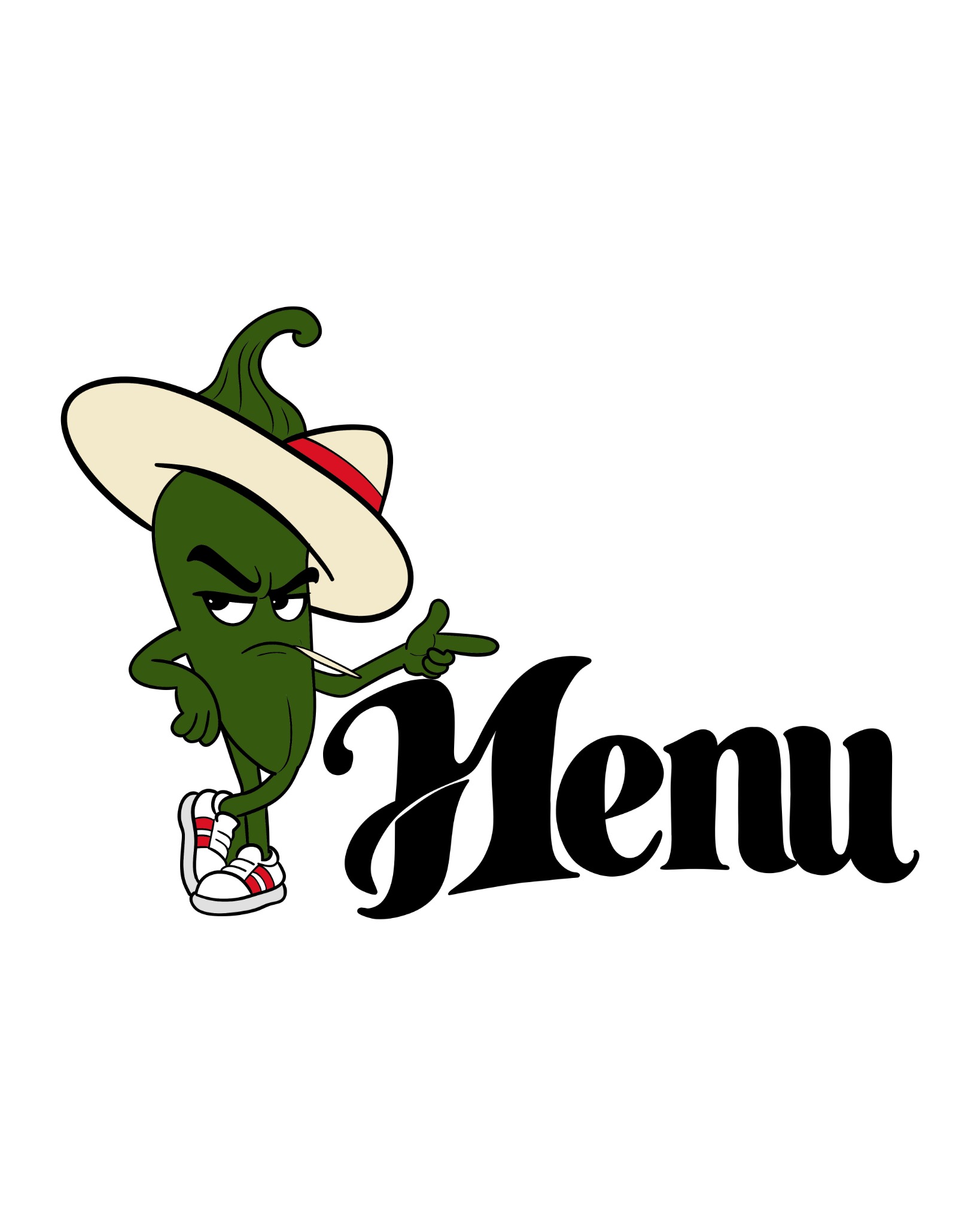
The identity is deliberately simple: navy, cream, green and black leave plenty of space for food, people and the room itself. The pepper brings the personality. He sits by the wordmark, points to the menu and appears in the small places where a host would naturally show up.
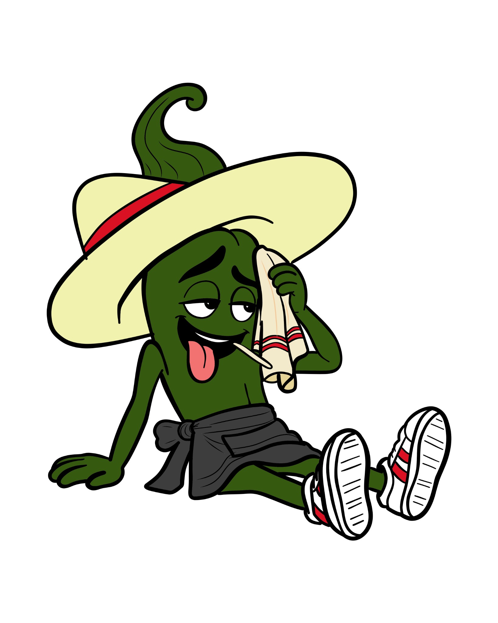
Mr Host was designed as a character system, not a one-off logo. The same pepper can be bored, mildly annoyed or completely chilled, then become a server, guide or small surprise on a bag. That gives BOCADO one recognisable voice across every touchpoint.
Project scope Brand strategy · Visual identity · Character design · Menu direction · Brand applications
05 / Meet the character
Meet
Padrón Pepper.
BOCADO’s Mr Host is a Padrón pepper with his own way of welcoming people: relaxed, observant and never too impressed.
He has heard every “one more round” before. That is part of the joke.
Just enough edge to be funny—never unfriendly or aggressive.
He takes his time. The guests are invited to do the same.
He points, waits, serves and turns up where the brand needs a human cue.
06 / In real life
One character.
Many moments.
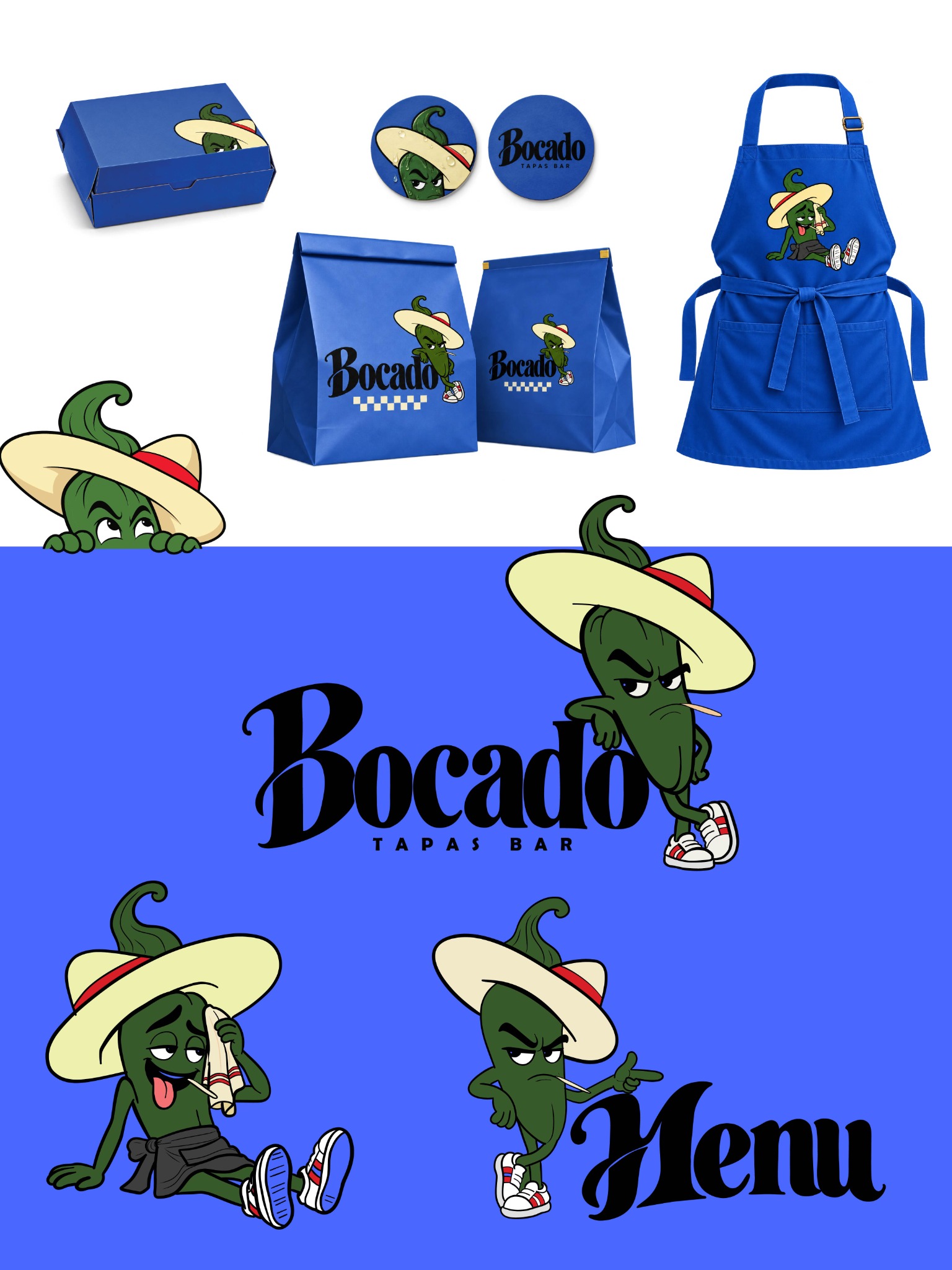
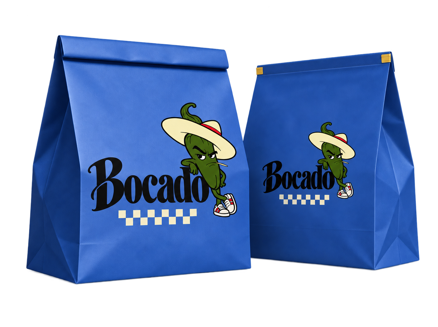
Once the character was defined, the rest of the identity could stay simple. A tight blue, cream, green and black palette holds the world together, while the pepper supplies the energy: hanging around the wordmark, calling people to the menu, appearing on packaging or joining the team behind the bar.
06 / In real life
A host
with character.
From menus and aprons to takeaway bags, the pepper makes the bar recognisable without taking over. Each appearance feels like the same host turning up in a new mood.
← Back to case studies