Build a premium identity for a store that sells many brands, while making JUNO itself the name customers ask for and its signature jewellery the most desired part of the experience.

01 / Case study
JUNO
Creating desire for a jewellery destination—and a signature worth keeping close.
02 / The brand
Desire,
made tangible.
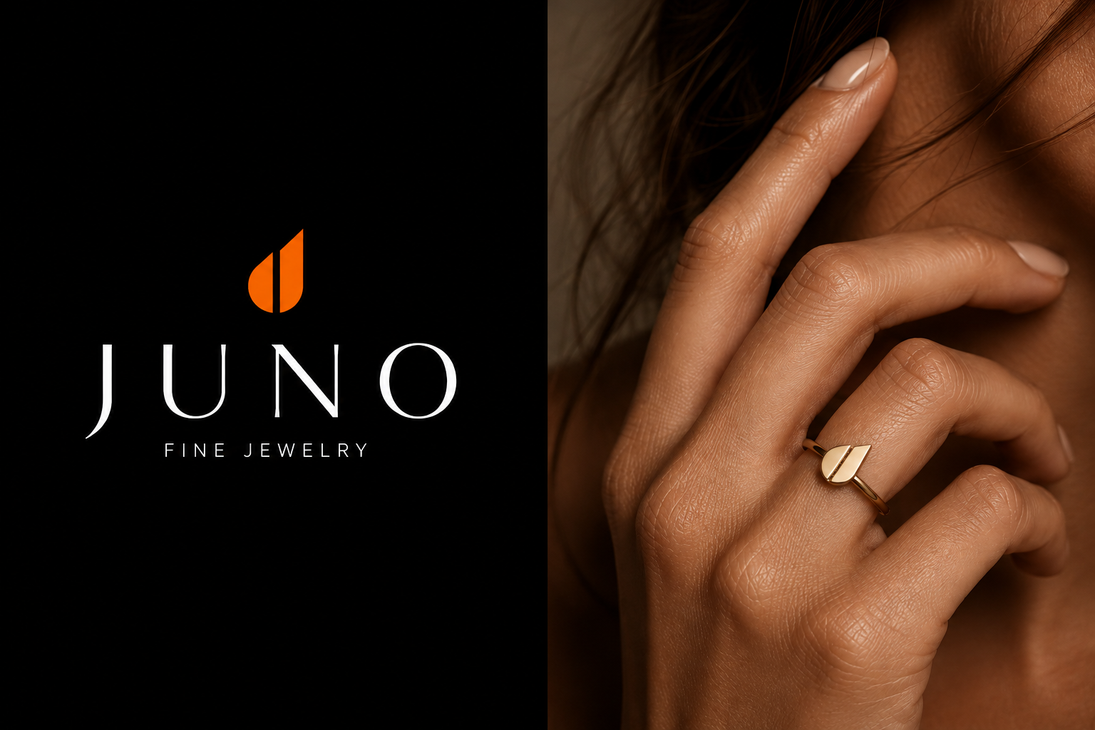
JUNO curates other jewellery brands, but its signature pieces give the store a reason to be remembered. The engraved bracelets, pendants and earrings carry the JUNO symbol—a recognisable detail that turns a beautiful purchase into something personal, collectable and wanted.
Desire is the core feeling. It is supported by aspiration, intimacy and self-expression: the sense that the piece says something quietly about the person who chooses it.
We used distinctiveness and symbolic meaning. A simple, repeatable mark increases recognition; close tactile imagery and restrained scarcity cues create perceived value without needing to shout.
03 / Creative direction
Luxury that
feels desired.
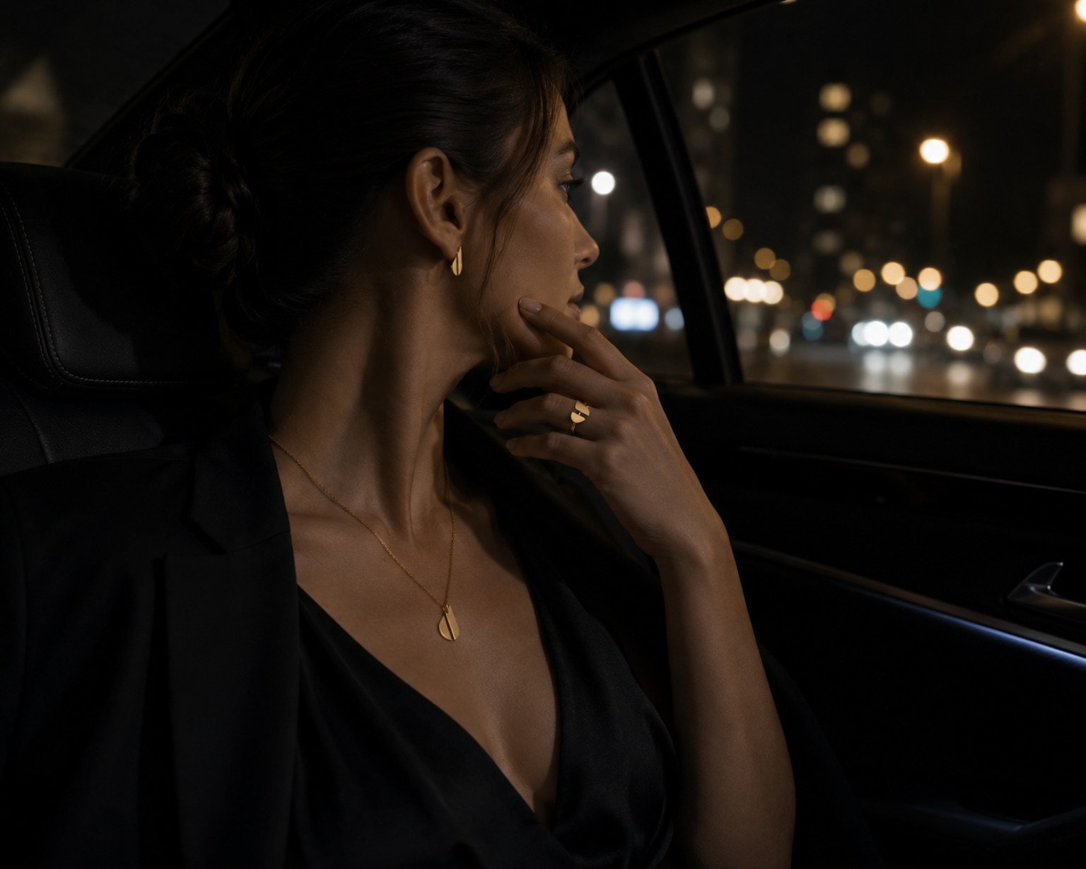
The direction avoids excess. Black creates focus, gold makes the pieces feel precious, and muted blue keeps the world modern and calm. Close photography makes the jewellery feel intimate—something a person can already imagine wearing.
Project scope Brand strategy · Brand identity · Art direction · Signature jewellery concept · Brand applications
04 / The JUNO symbol
A letter J,
made to wear.
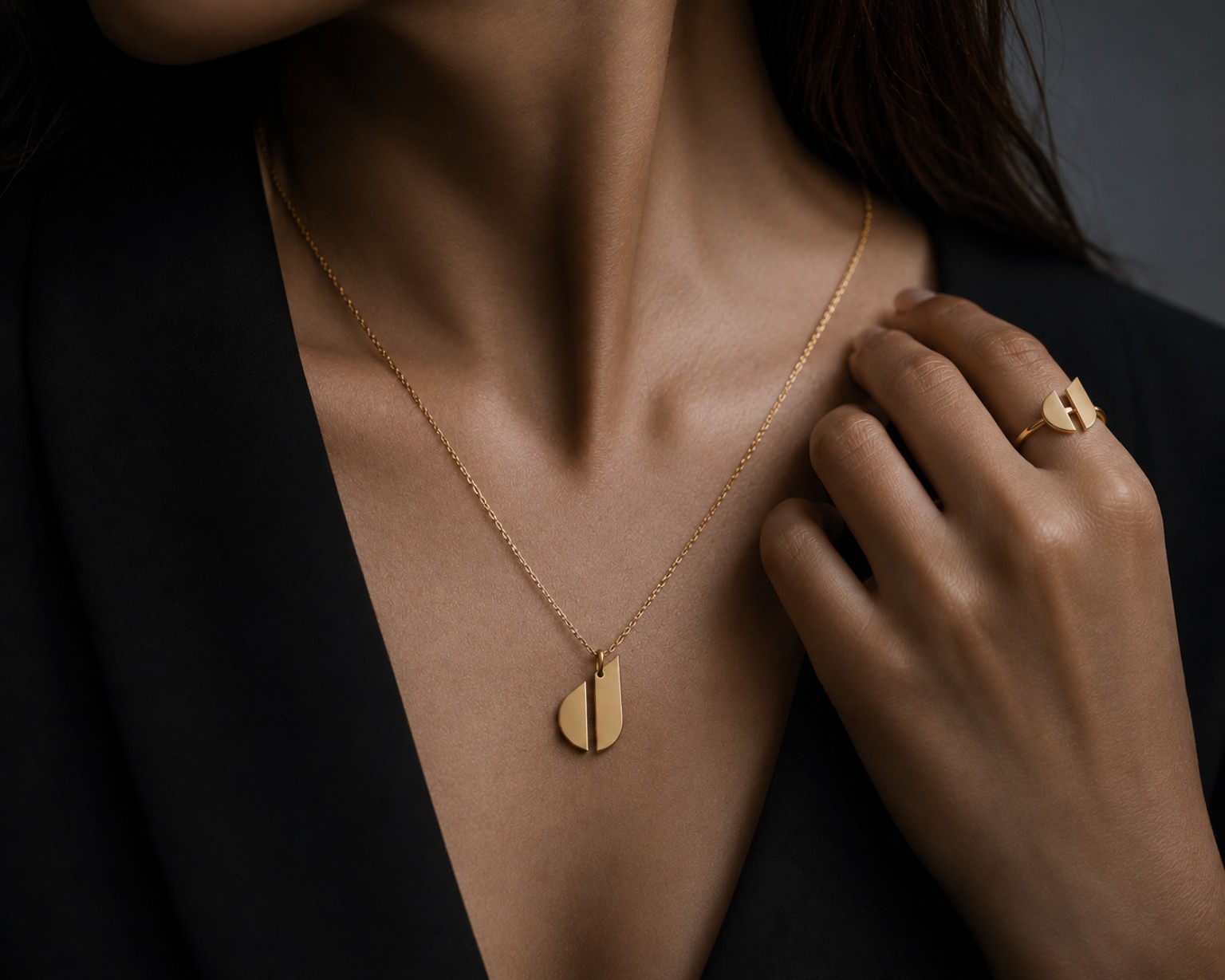
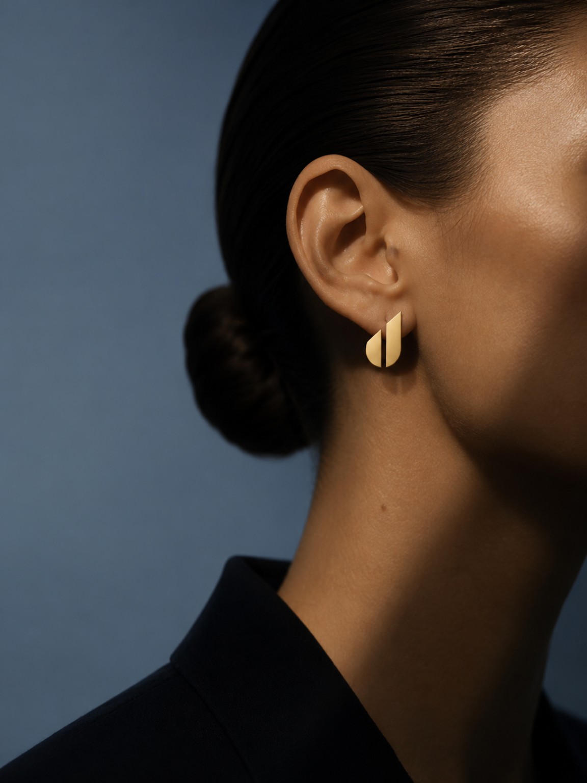
The symbol begins with the letter J, divided into two clean forms. Together they read as a small jewel: precise, balanced and unmistakably JUNO. It was designed not only as a logo, but as an object—so it could be engraved into a bracelet, shaped as a pendant or worn as an earring. Every piece becomes both jewellery and a quiet signature of the store behind it.

05 / In real life
More than
what is sold.
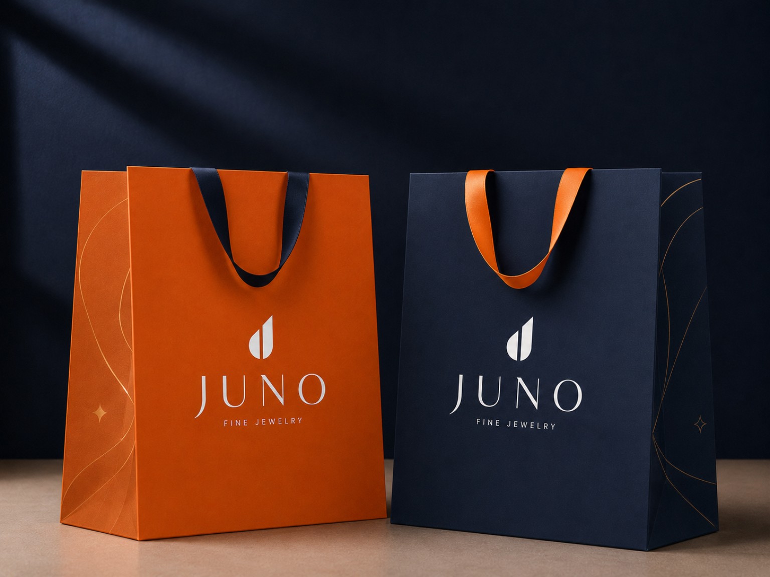
JUNO can curate many labels without becoming invisible among them. The signature line gives people a reason to return: a small symbol they recognise, want and choose for themselves. That is the role of the identity—not merely to look luxurious, but to make belonging to JUNO feel desirable.
← Back to case studies