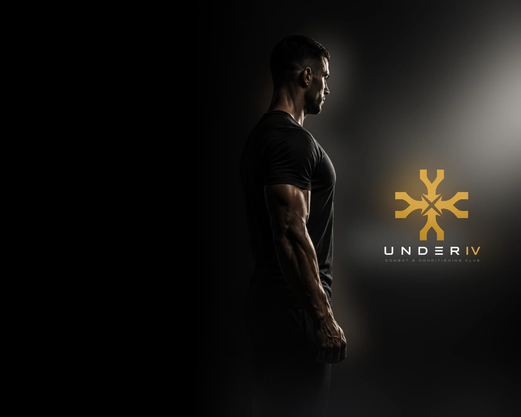
Create a distinctive premium club identity without relying on familiar gym shorthand: fists, flames, shields and visual noise.

01 / Case study
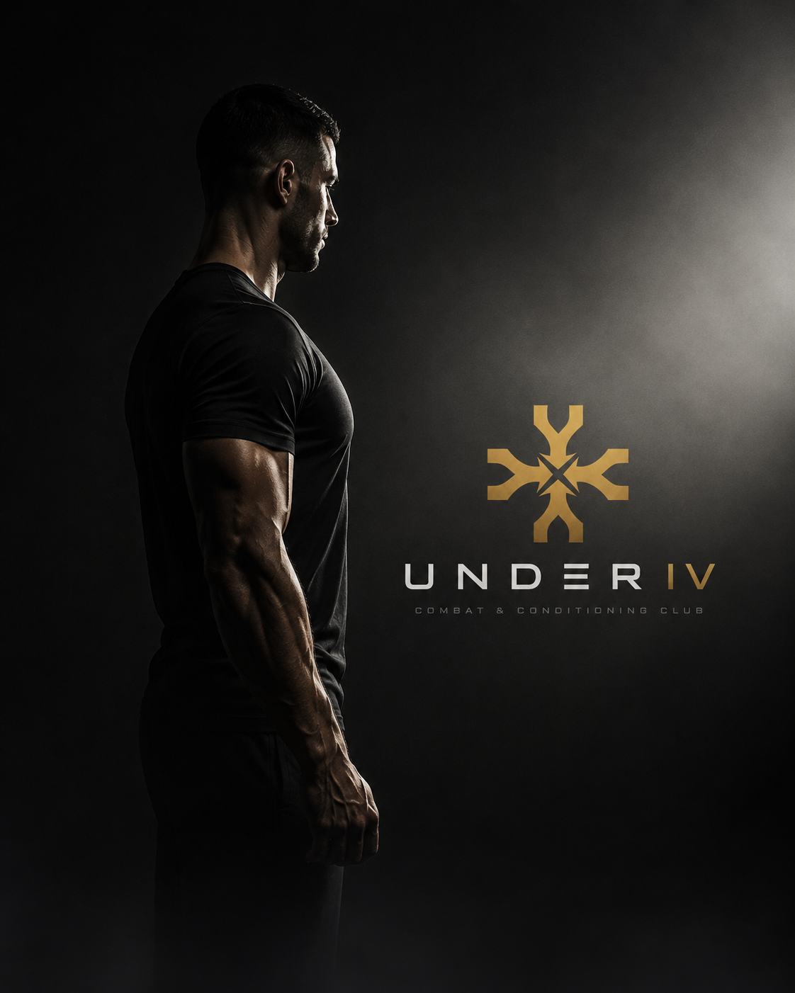
UNDER IV
Creating a private club identity where strength is felt as control, belonging and self-command.
02 / The brand
Strength,
with balance.
UNDER IV is a private combat and conditioning club for men carrying responsibility, pressure and ambition. The identity had to make physical challenge feel purposeful—not theatrical—while building the quiet status of a place people want to belong to.
Controlled strength is the core feeling. It is supported by capability, composure and belonging—the confidence of knowing you can handle pressure.
We used symbolic depth and structured restraint. A mark that reveals more at a second look gives people a reason to stay curious, recognise it and make it part of their own identity.

03 / Creative direction
Power without
the performance.
The world is dark, disciplined and deliberately quiet. Black gives focus; restrained gold signals value; smoke and shadow add atmosphere without becoming cliché. The aim is not to make strength look louder. It is to make it look considered.
Project scope Brand strategy · Brand identity · Art direction · Membership concept · Brand applications
04 / The UNDER IV symbol
Four Ys.
One hidden X.
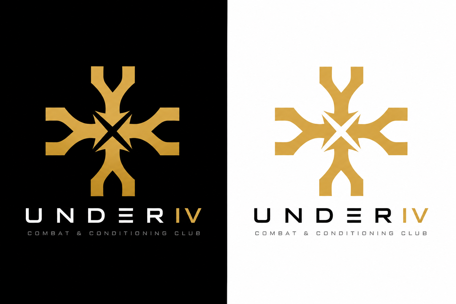
The emblem was constructed to carry the whole idea in one form: masculine drive, individual discipline, a shared club and strength with balance. It steps away from predictable fitness symbolism, focusing instead on what happens when energy is given structure.

The starting point
The Y chromosome is commonly associated with male biological development. It became a subtle starting reference for a brand made for men: energy, physicality and the instinct to act—without turning the mark into a literal diagram.
Four forms. One club.
Four identical Y forms rotate around one centre. Together they construct the Roman numeral IV, turning separate forces into one disciplined structure: individual men connected by a shared standard.
The hidden discovery
Where the four Ys meet, negative space reveals an X. This second chromosome introduces balance and depth. It makes the symbol more than a statement of masculinity: confidence, control and connection are part of the same system.
05 / Customer-ready brand system
A system built
to last.
The UNDER IV identity begins with a biological reference, but the final mark is intentionally abstract.
The Y form provided a meaningful starting point for the club’s male audience. Repeating it four times allowed the structure to become IV—the name itself—rather than simply placing a symbol beside a wordmark.
The X appears only in the negative space. That hidden layer is important: it stops the identity becoming one-dimensional and reflects the kind of strength the club stands for—power with awareness, discipline and balance.
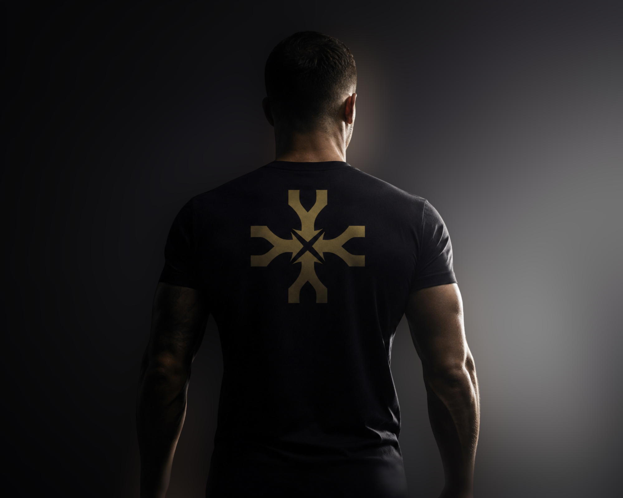
Across membership, apparel and training objects, the emblem becomes a sign of belonging. It works as a badge at a distance, but rewards closer attention with a story that is built into its construction.
The result is not a generic training-club logo. It is a recognisable system for a club where men can train hard, reset and become more capable in the rest of their lives.


06 / The final brand world
Made for people
who hold themselves to more.
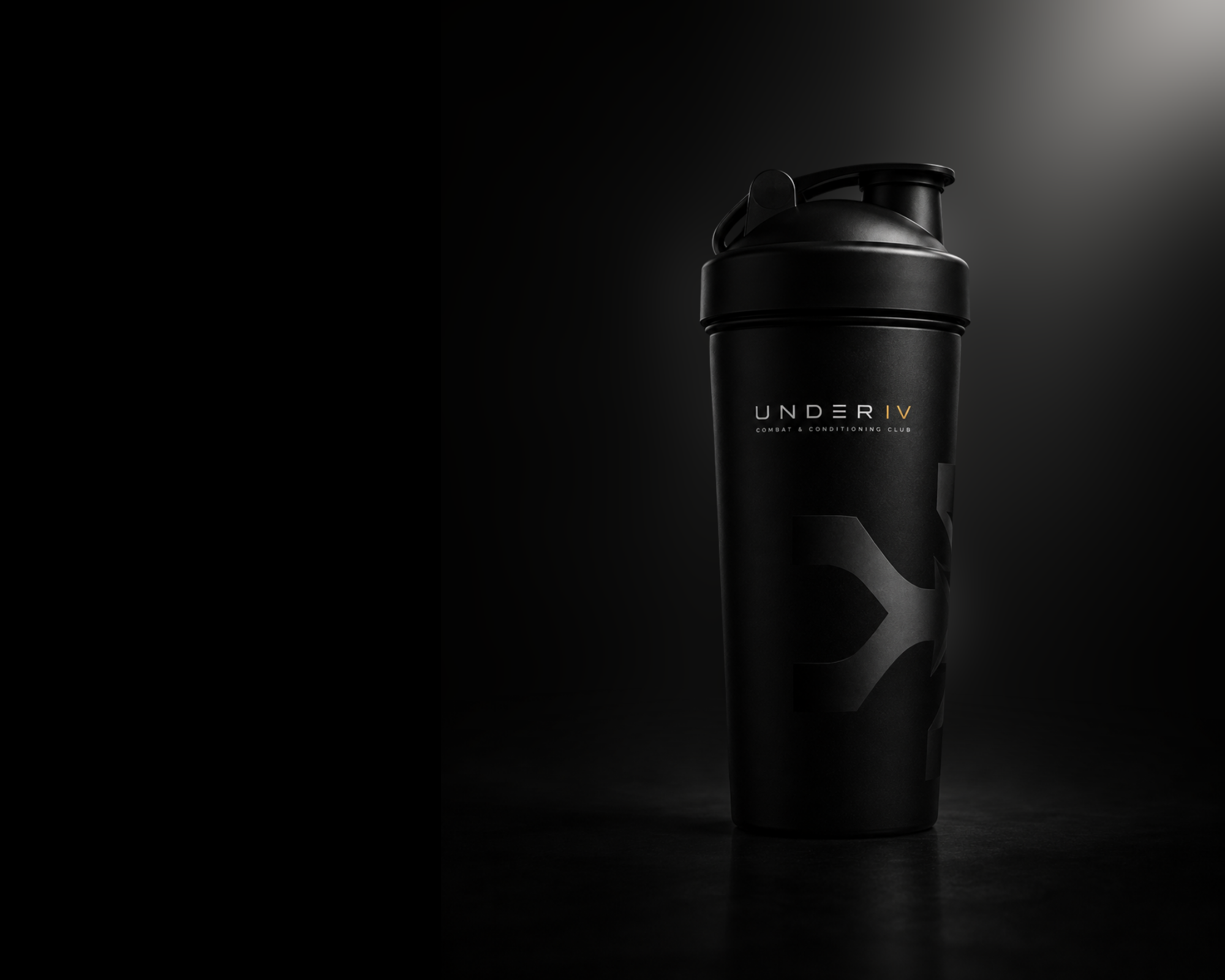
UNDER IV turns membership into a standard rather than a status performance. The identity keeps the club distinctive wherever it appears—on apparel, a bottle, a card or a doorway—without losing the calm self-control at the centre of the idea.
← Back to case studies